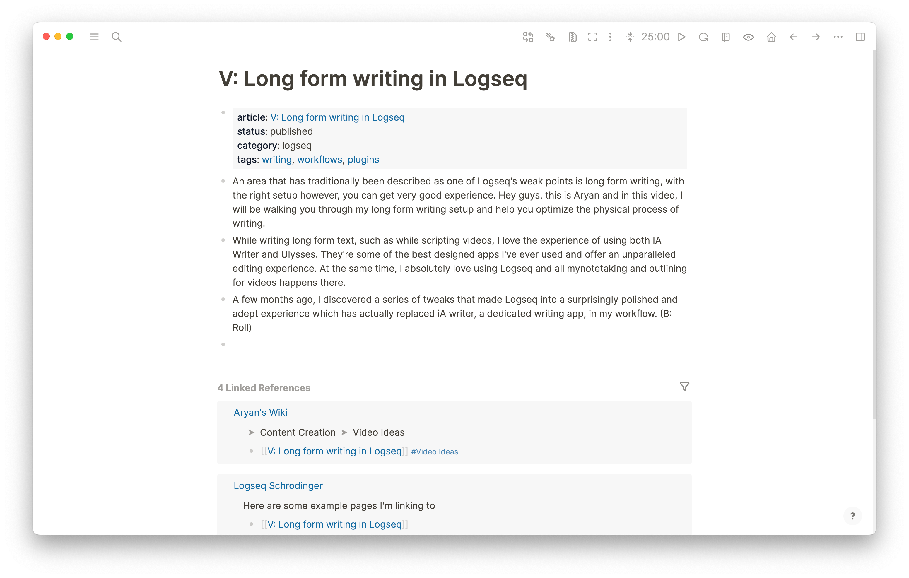
An area that has traditionally been described as one of Logseq’s weak points is long form writing, however, with the right setup, it’s very much possible to get an excellent writing experience
While writing long form text, such as while scripting videos, I absolutely adore the experience of using both iA Writer and Ulysses. They’re some of the best designed apps I’ve ever used and offer an unparalleled editing experience. At the same time, I absolutely love using Logseq and all my notetaking and outlining for videos happens there.
A few months ago, I discovered a series of tweaks that made Logseq into a surprisingly polished and adept experience which has actually replaced iA writer, a dedicated writing app, in my workflow.
This is what we’ll start with. Where can we go from here?
Logseq Focus Mode
The first component of my system is the Logseq Focus Mode plugin. It’s an amazing plugin which contains multiple utilities to make the editing experience in Logseq nicer.
You can download the plugin from the logseq plugin marketplace, accessible via the keyboard shortcut t p or by clicking plugins via the three dots on the top right corner
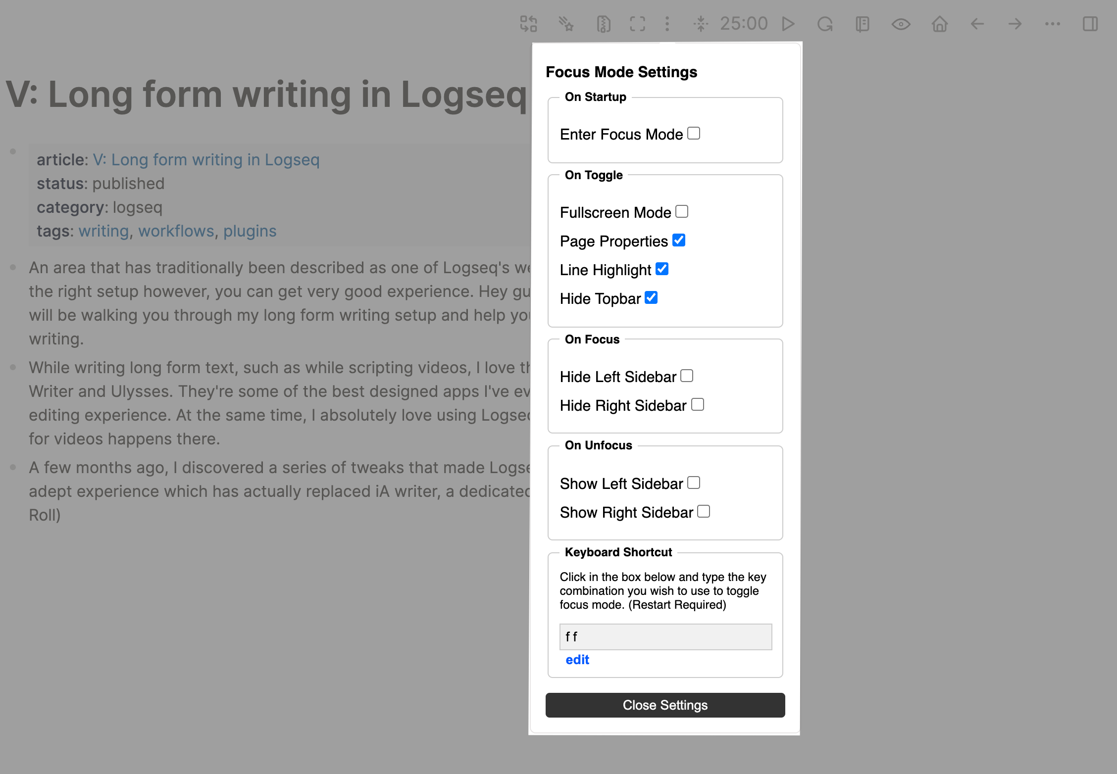
You can access the plugin settings from this icon in the toolbar and configure the actions that you want to have occur. You can configure the plugin to enter focus mode on startup or rather, which is what I use, simply click the button to enter the focus mode. To configure focus mode, simply select the options you’d like to have. I’ve personally enabled hide page properties, line highlight and hide top bar which I actually submitted as a PR to the plugin. I also sometimes enable the options for hide left sidebar and right sidebar just for convenience sake.
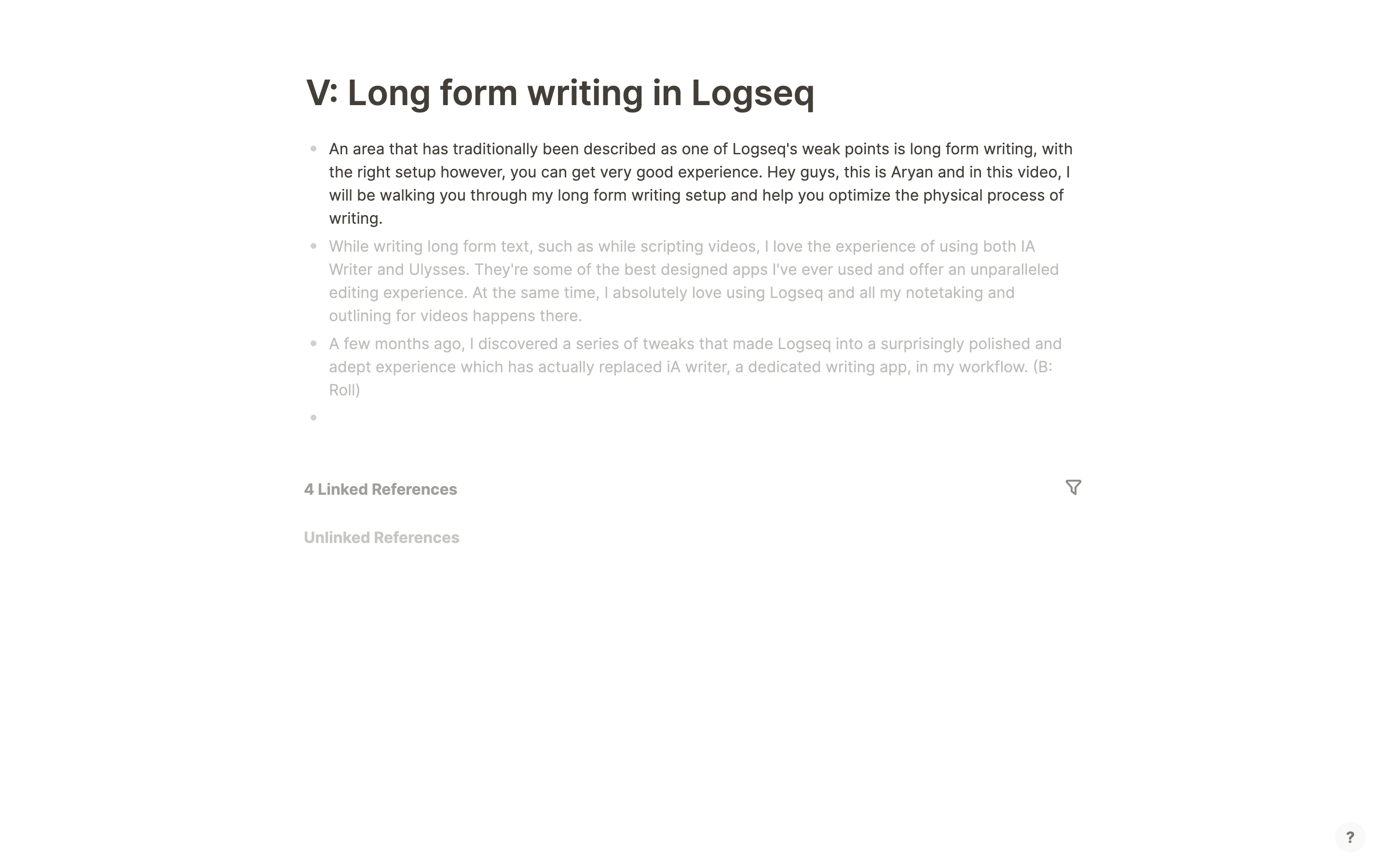
On its own, you can already see the massive impact this can have, with the entire screen already looking so much neater and more conducive to writing. I’ve also collapsed the linked references section to further tone down the clutter. There is however, more that can be done.
Document Mode
Document mode is an in built feature in Logseq which essentially allows you to treat the page as a regular Obsidian style document.
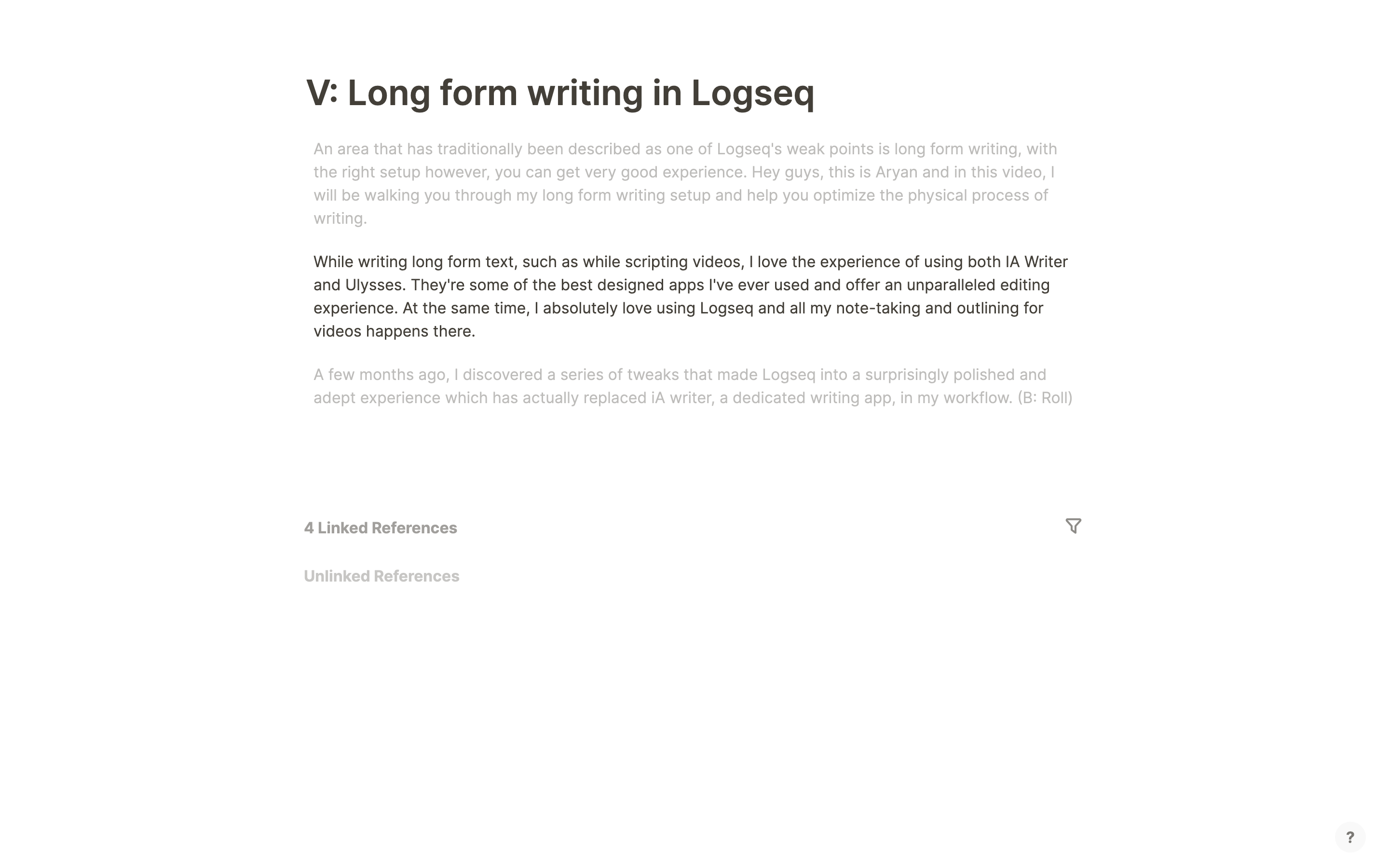
You’ll notice that bullets disappear and also, importantly, that clicking enter doesn’t create a new block but rather a new line in the block you are already writing. This makes it a lot easier to write longer paragraphs and in the case that you, like me, prefer splitting individual paragraphs into their own individual pages while still maintaining this even bulleted look, you can just use shift enter to create a new block.
Neat!
This makes for a great longer form and more textual writing experience, especially combined with the line highlighting from the previous step.
CSS Tweaks
The next step are some css tweaks which are a great and simple way to modify logseq to your liking. The first is removing the help button on the bottom right corner. While this is normally pretty useful, you’re unlikely to be trying new features while writing a long form article and it therefore makes sense to hide it to reduce the clutter on the screen. In order to do so, paste the following code in your custom.css file.
.cp__sidebar-help-btn {
  display:none;
}
The next tweak is going to be removing the references section. While they are amazing features, when writing in a distraction free environment, they can often distract from what is supposed to be the main focus, the text that you are making. To hide this, type the following code into your custom.css file.
.references.mt-6.flex-1.flex-row{
  display: none;
}
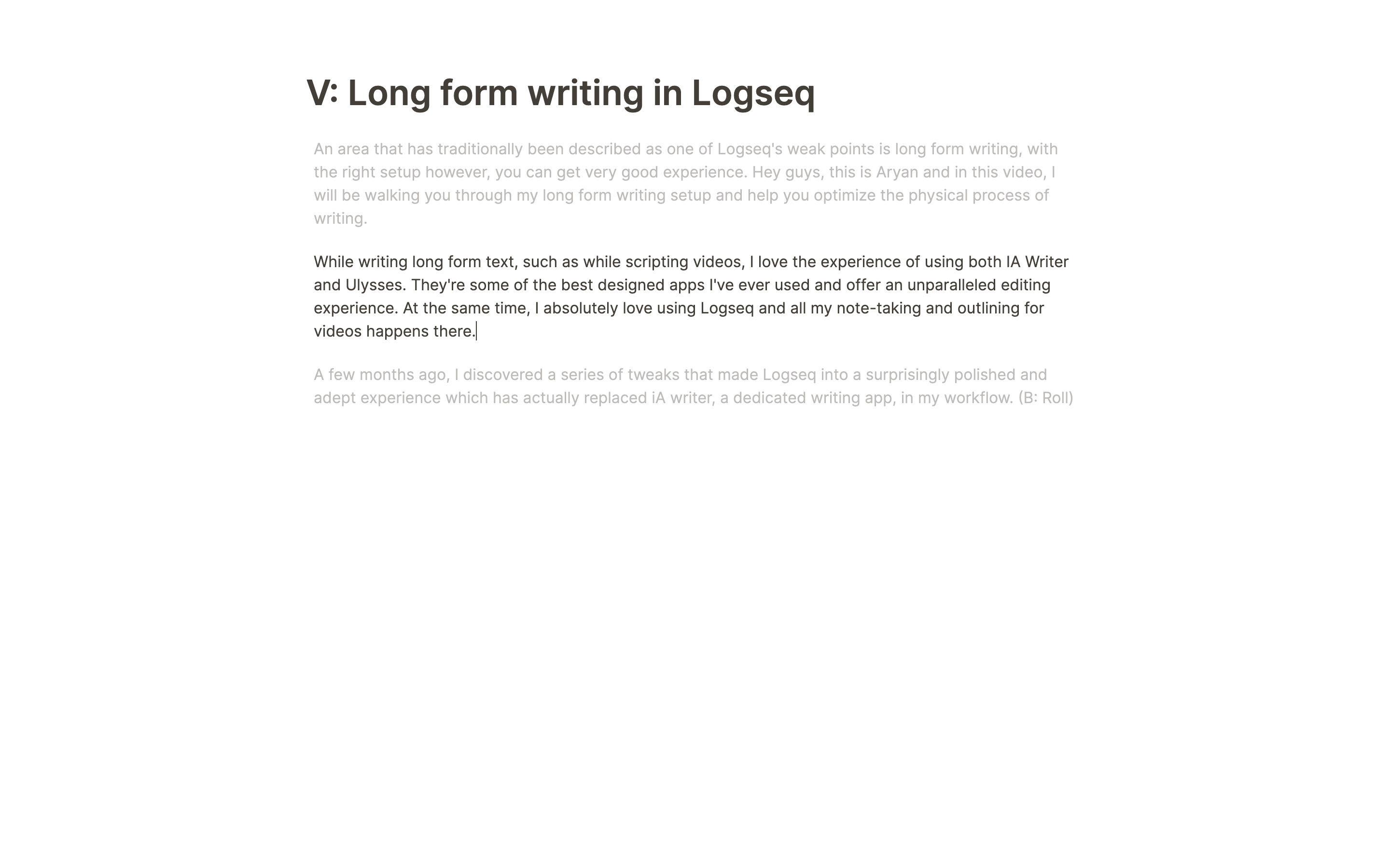
With these changes, logseq is starting to look beautiful!
Themes
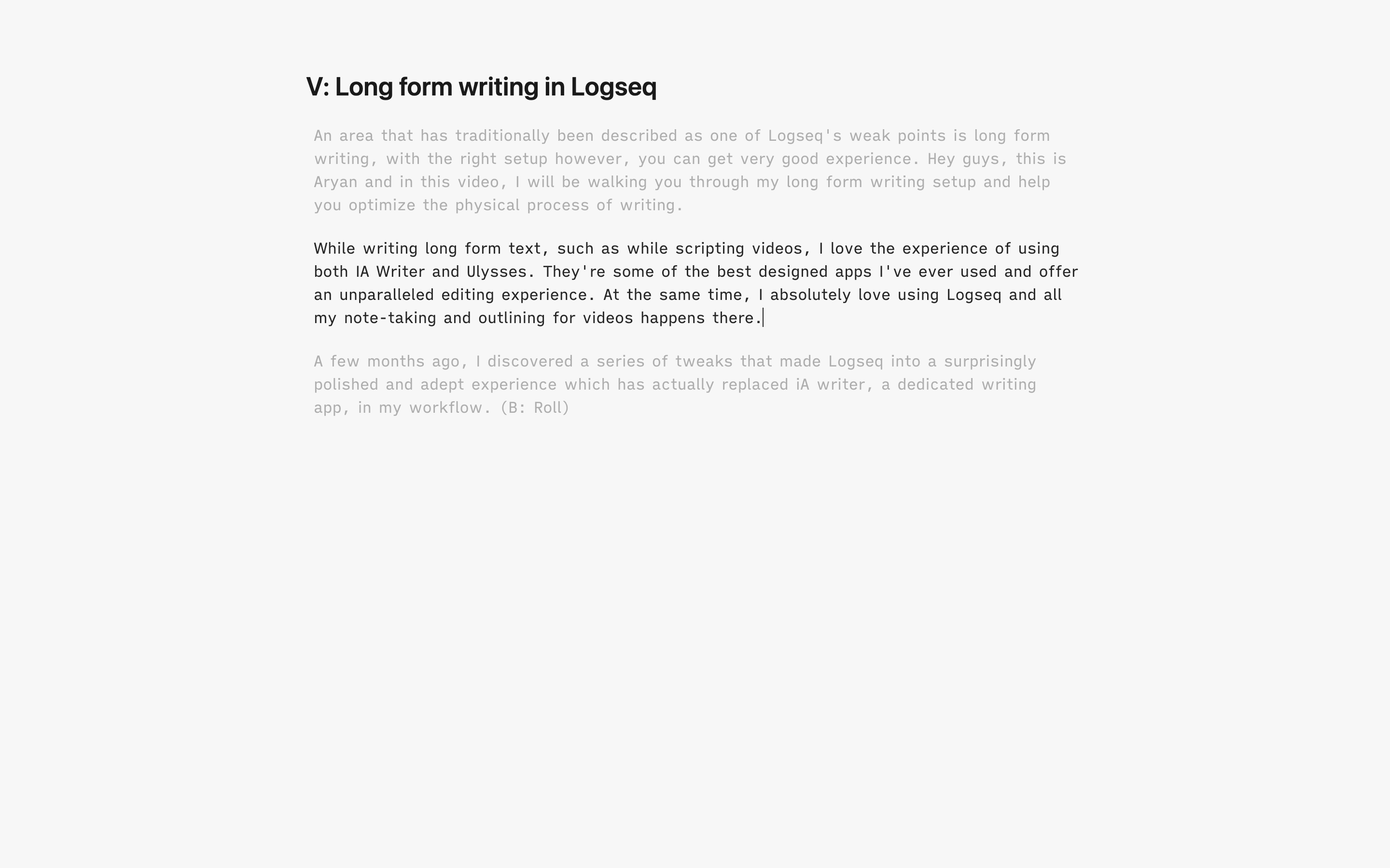
Finally comes themes. iA writer is one of my favorite distraction free writing apps and I love the way it’s interface is structured and designed. The amazing alexander rink has actually created an iA writer style theme for Logseq, this was the theme that i used until I came across the miA theme by Martin Scott. This is another theme that is based on iA writer, but also mixes aspects of macOS such as the San Francisco Font for titles and labels. It’s very neat and minimalistic and looks great, especially on macOS. Both are great themes and if you’re up for another option, there is also the Bear Theme, also by Alexander Rink.
Adding one of the iA themes makes the interface absolutely beautiful. We already know iA Writer to be one of, if not the best distraction free long form writing app and these themes brings the experience over to logseq.
Here’s the Quattro theme in action! It’s subtle, but gorgeous, especially when you start having more text and links on the page.
Bonus Tips and Tricks!
In addition to the above, there are a few more handy tricks here and there which can further enhance the experience.
Hiding Brackets in Page links
One really neat and simple tweak that you can perform is to hide brackets. Normally, when you are creating page links, you can clearly see the brackets, this is not the case for local links and they arguably look more sleek. However, one fairly unknown feature is that you can actually hide the brackets so that link looks as a naturally flowing part of the text distinct just by a small highlight dictated by your theme. To toggle it, use the shortcut cmd/ctrl+c+b
Here’s how it looks!


Using wide mode
Sometimes, when you’re writing a very long text, it can get distracting to scroll up or down repeatedly and it’s often very convenient to quickly refer up and down the page. This allows you to increase the width of the text so that it takes more space which is especially useful in larger monitors. To toggle it, use the shortcut t w
Final Notes
This is a setup that’s personally worked well for me and hopefully helps you all as well.I hope you like this and would love to know your thoughts, questions and feedback!